
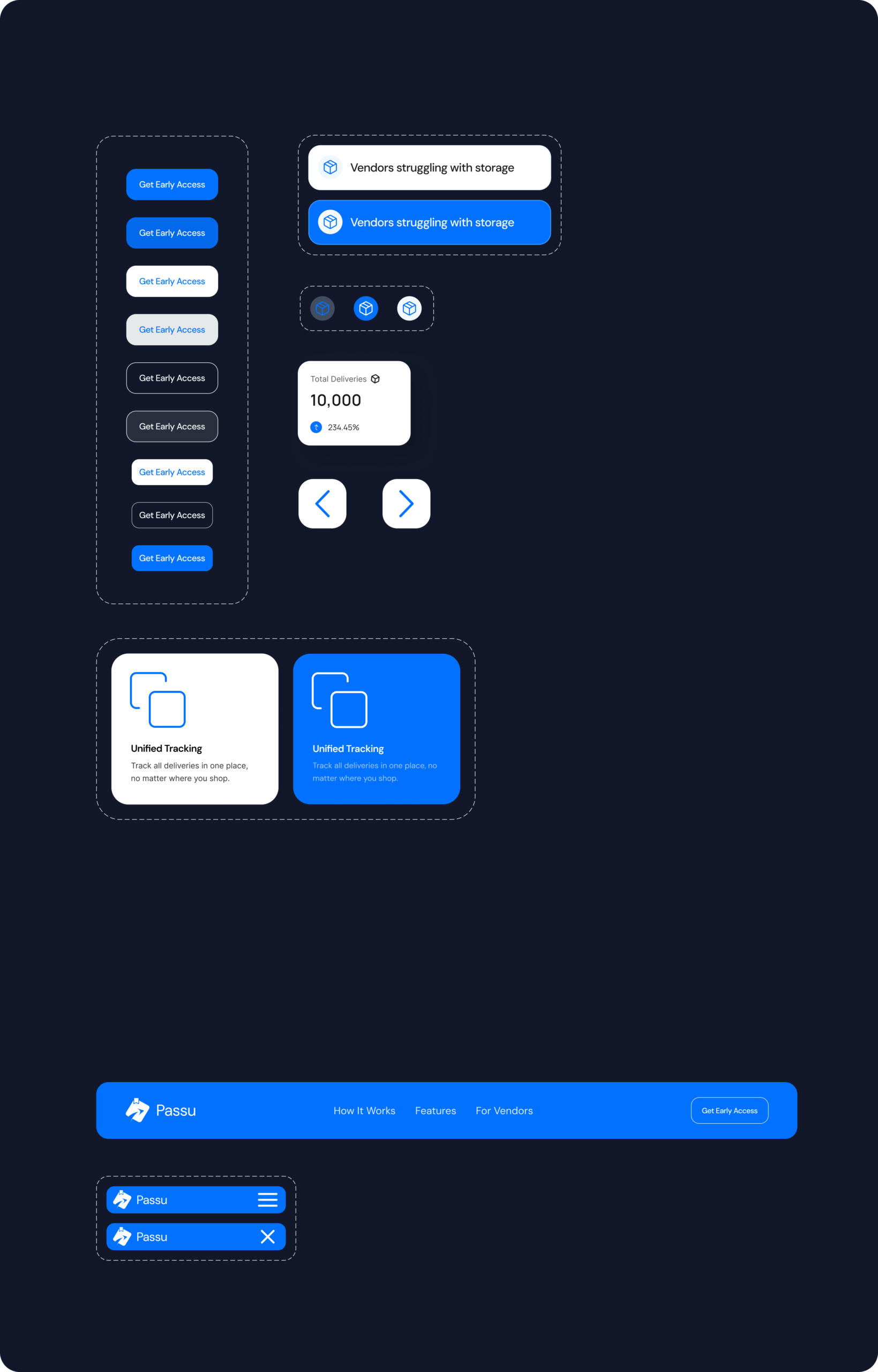
Dark Canvas Component Architecture: Before committing to visual aesthetics, I isolated and mapped every recurring element on a dark canvas. This forced an uncompromising focus on visual hierarchy and contrast rather than relying on color alone.
AI-Accelerated Scaling: To meet the strict 8-week end-to-end timeline, I integrated AI tools to rapidly iterate through user flows and component variations, ultimately reducing the overall design lifecycle by 30%.
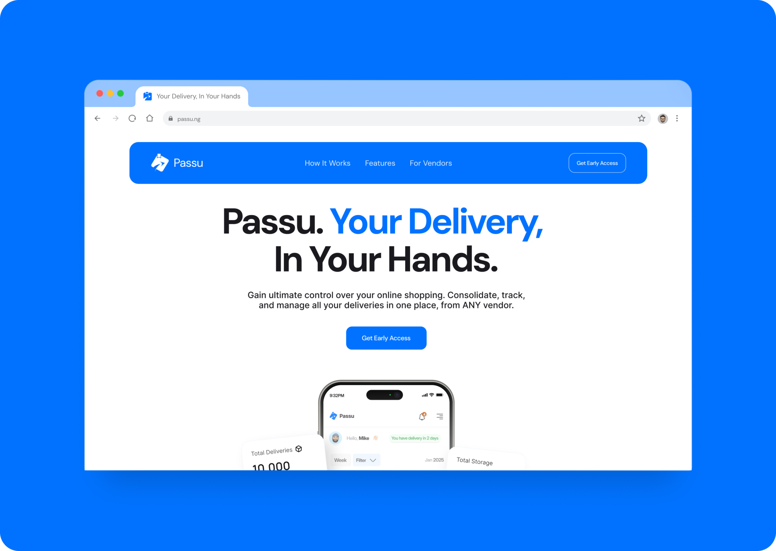
The Above-the-Fold Pivot: Early research indicated that users needed to understand the product's value instantly. Instead of relying on abstract feature descriptions, I made the crucial decision to surface a high-fidelity preview of the Passu dashboard completely above the fold.
Accessible by Default: I engineered the platform's primary blue (#0072FF) to pass WCAG AA contrast standards and implemented non-color status cues—pairing icons with text labels—to ensure delivery statuses were perfectly clear for color-blind users.
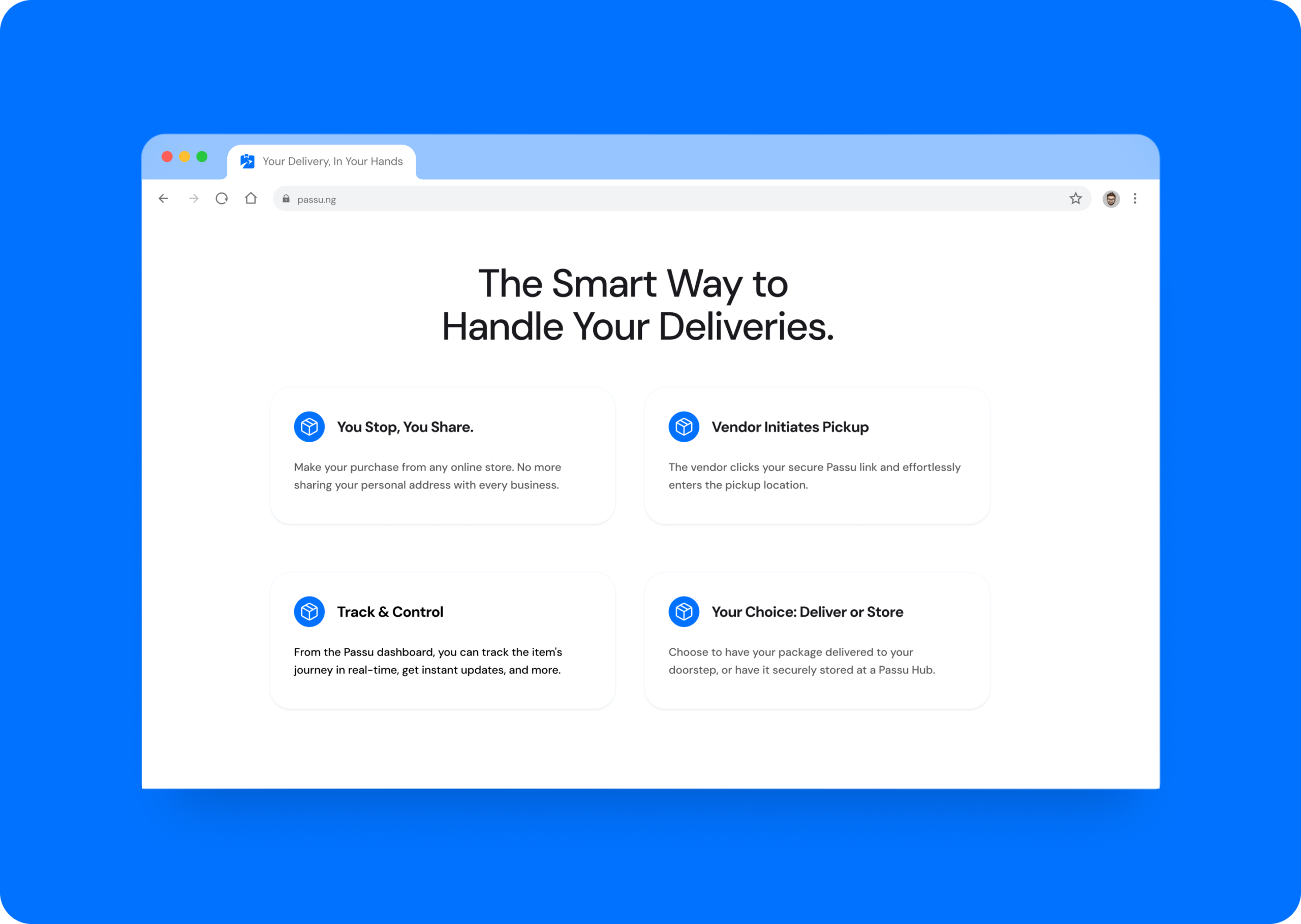
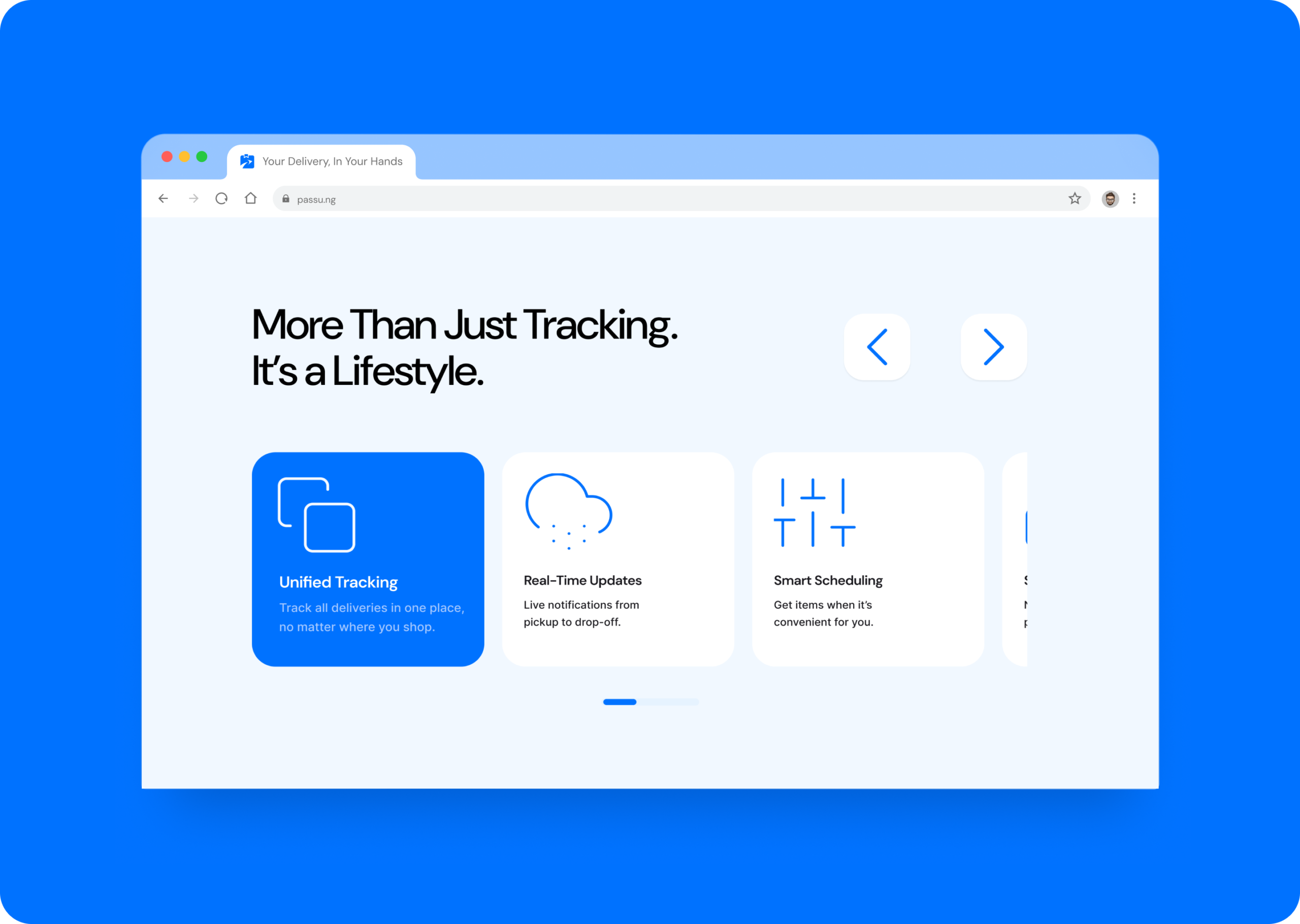
Validated Usability: Following design refinements, usability testing with 5 participants yielded a task success rate of over 90%.
Instant Comprehension: Users were able to locate the primary call to action (CTA) with over a 95% discovery rate and understood the platform's value proposition in under 10 seconds
Developer Readiness: Shipped comprehensive developer documentation and component specifications, ensuring the UI components translated flawlessly during the engineering handoff.