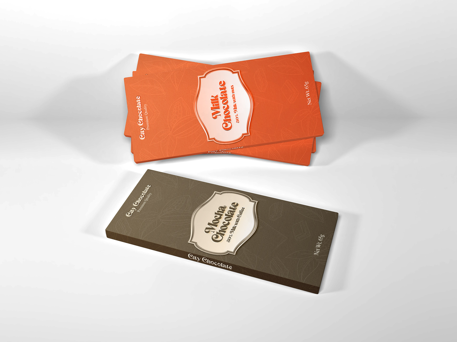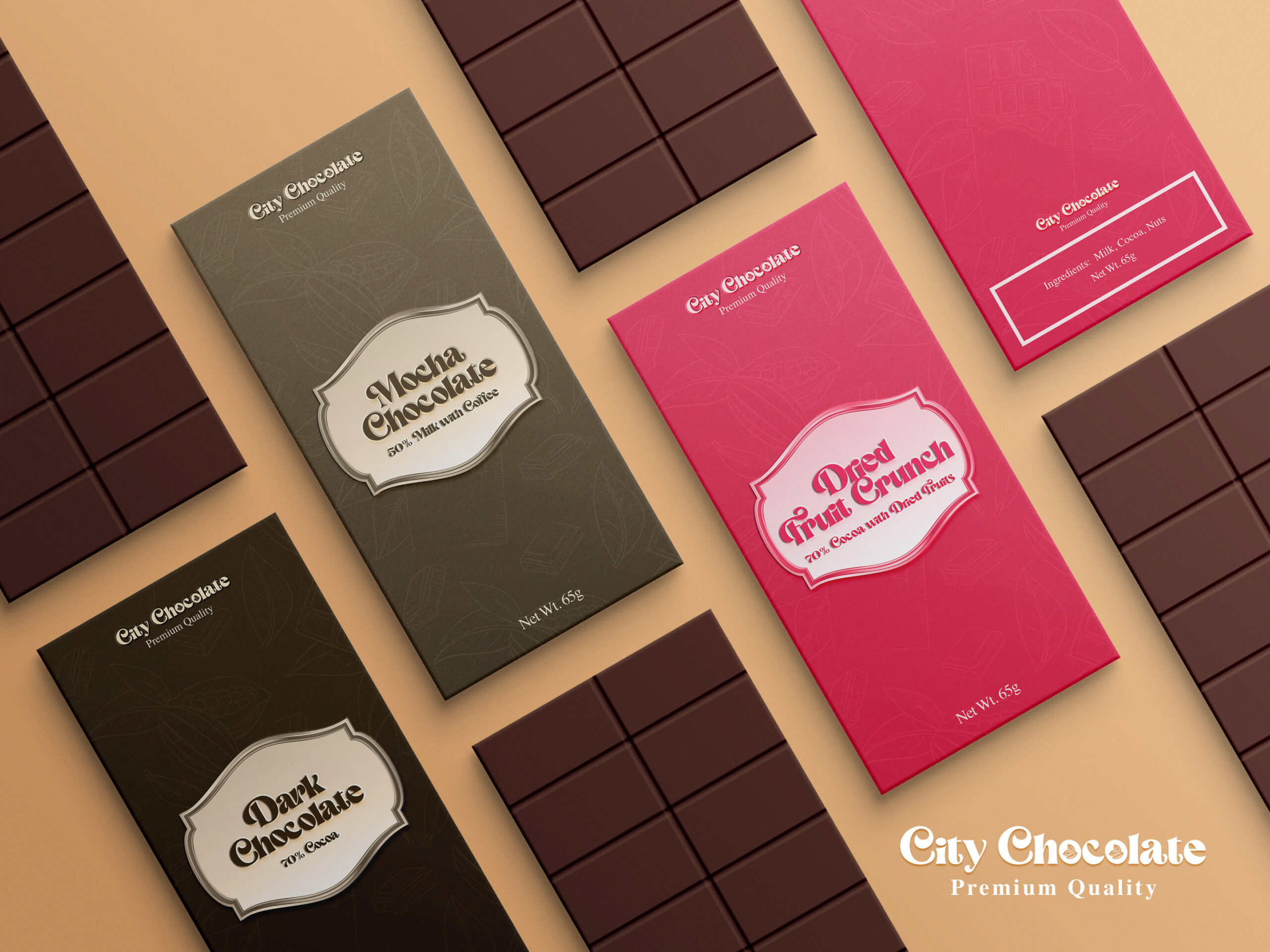
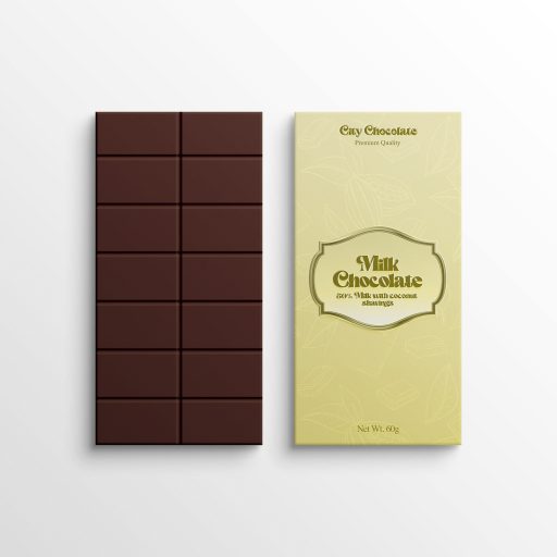
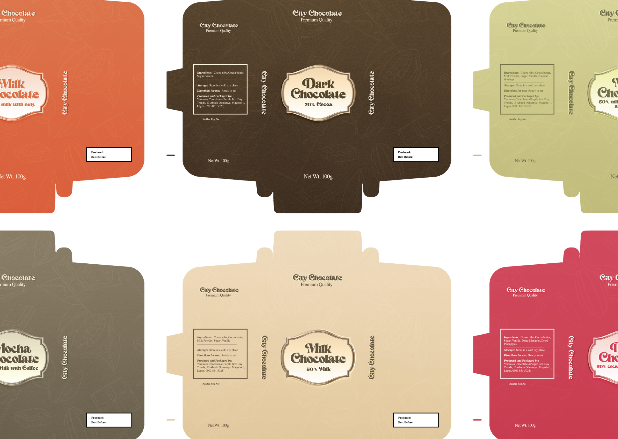
I introduced a retro-elegant serif typography for the wordmark and established a distinct color-coded identity system for variants, including an earthy brown for Mocha Chocolate and a vibrant pink for Dried Fruit Crunch.
I centered the flavor profiles within metallic-style badge emblems to immediately elevate the product's premium aesthetic.
To manage the strict realities of physical production, I engineered precise, die-cut packaging schematics in Adobe Illustrator across six different flavor profiles.
I meticulously typeset mandatory regulatory information, ingredients, and the partner's production details to ensure full commercial compliance without cluttering the minimalist design.
Shipped on Schedule: The complete branding and packaging schematics were researched, designed, and sent to print, wrapping the entire project within the strict 3-month deadline.
Stakeholder Synergy: By leading the creative strategy from the front, the final product successfully unified the vision of the external business owner and Chocolate City Music’s C-suite.