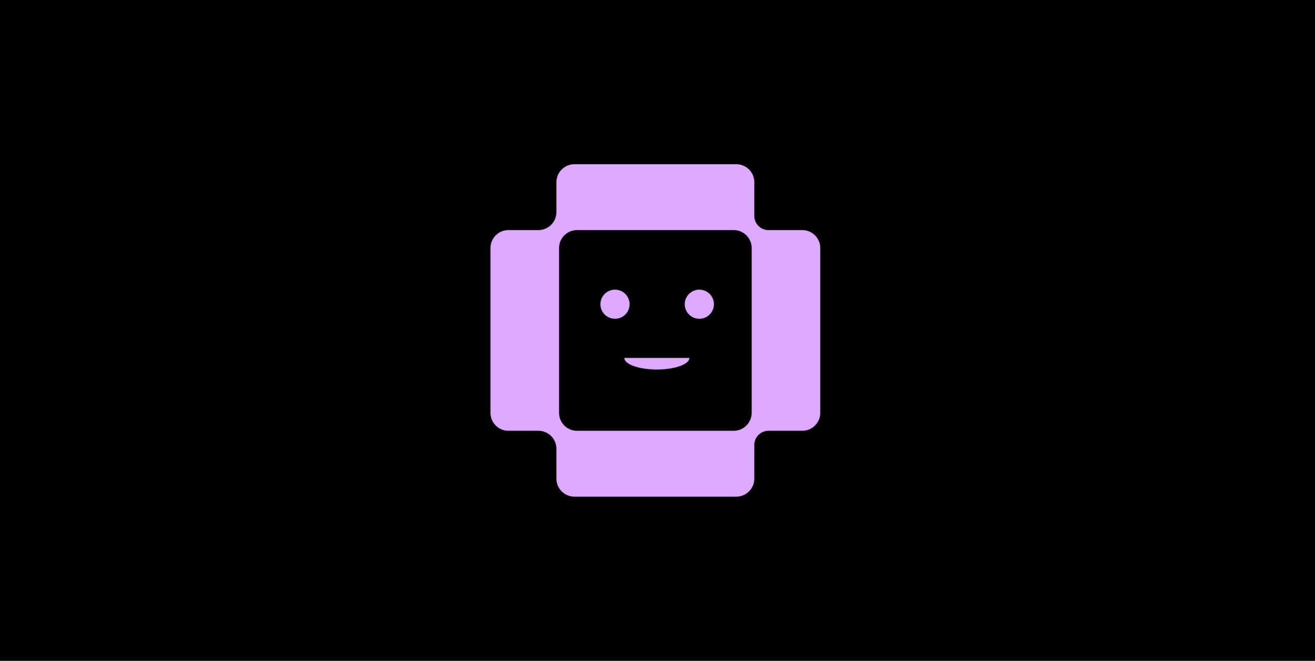
The Companion Identity:
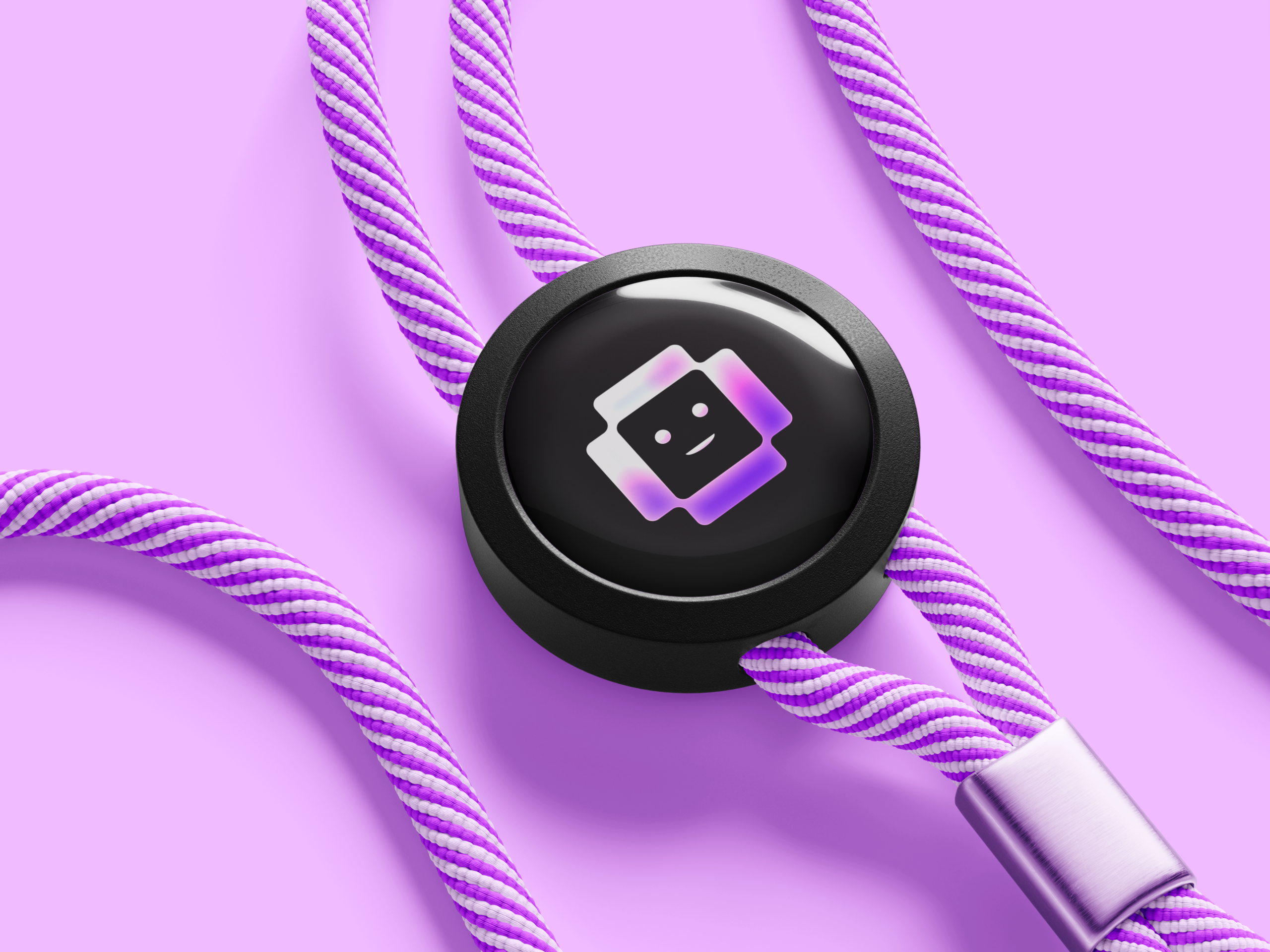
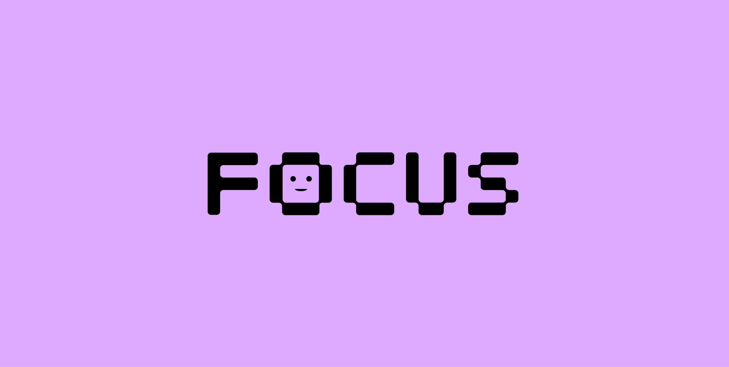
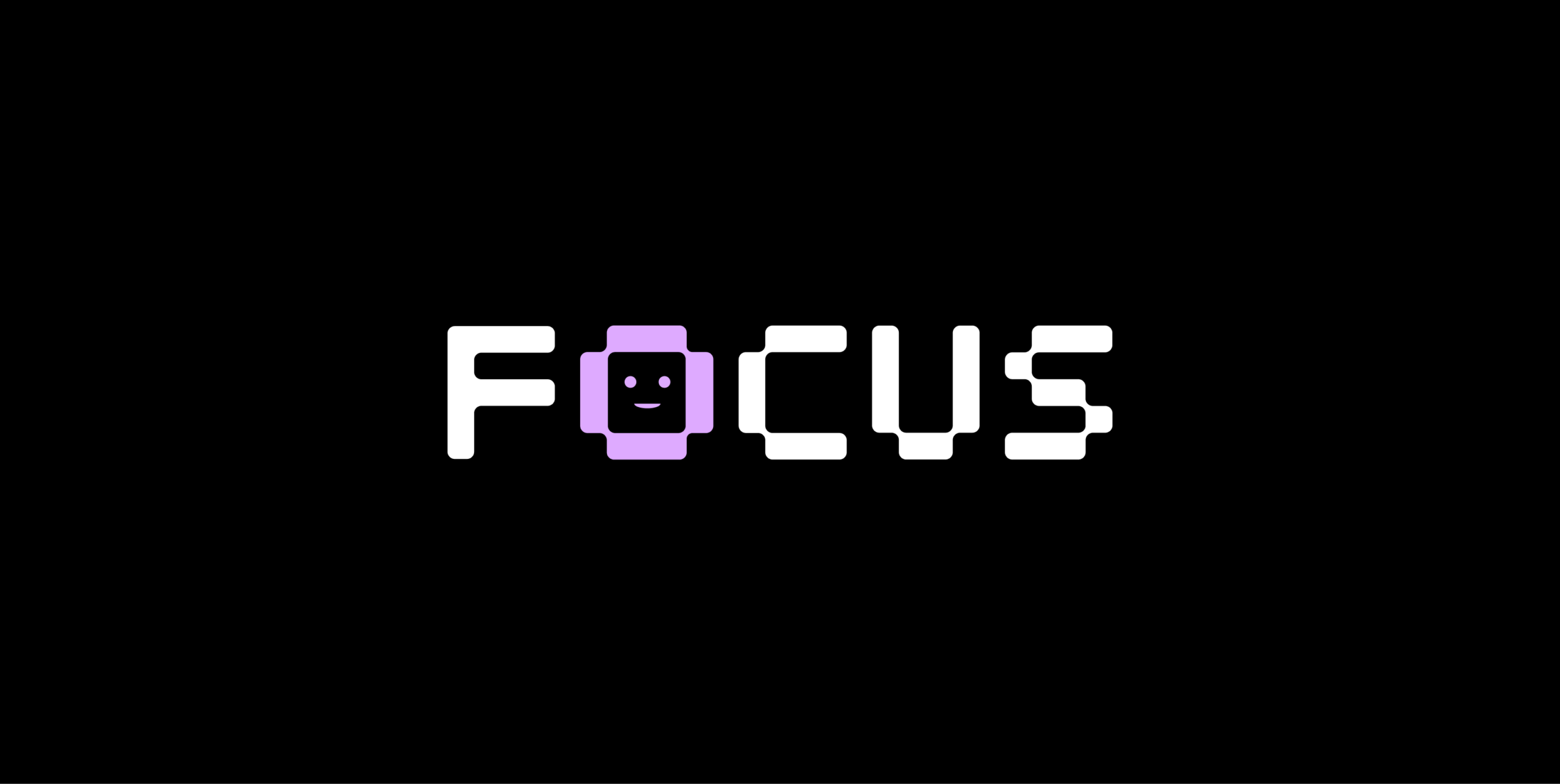
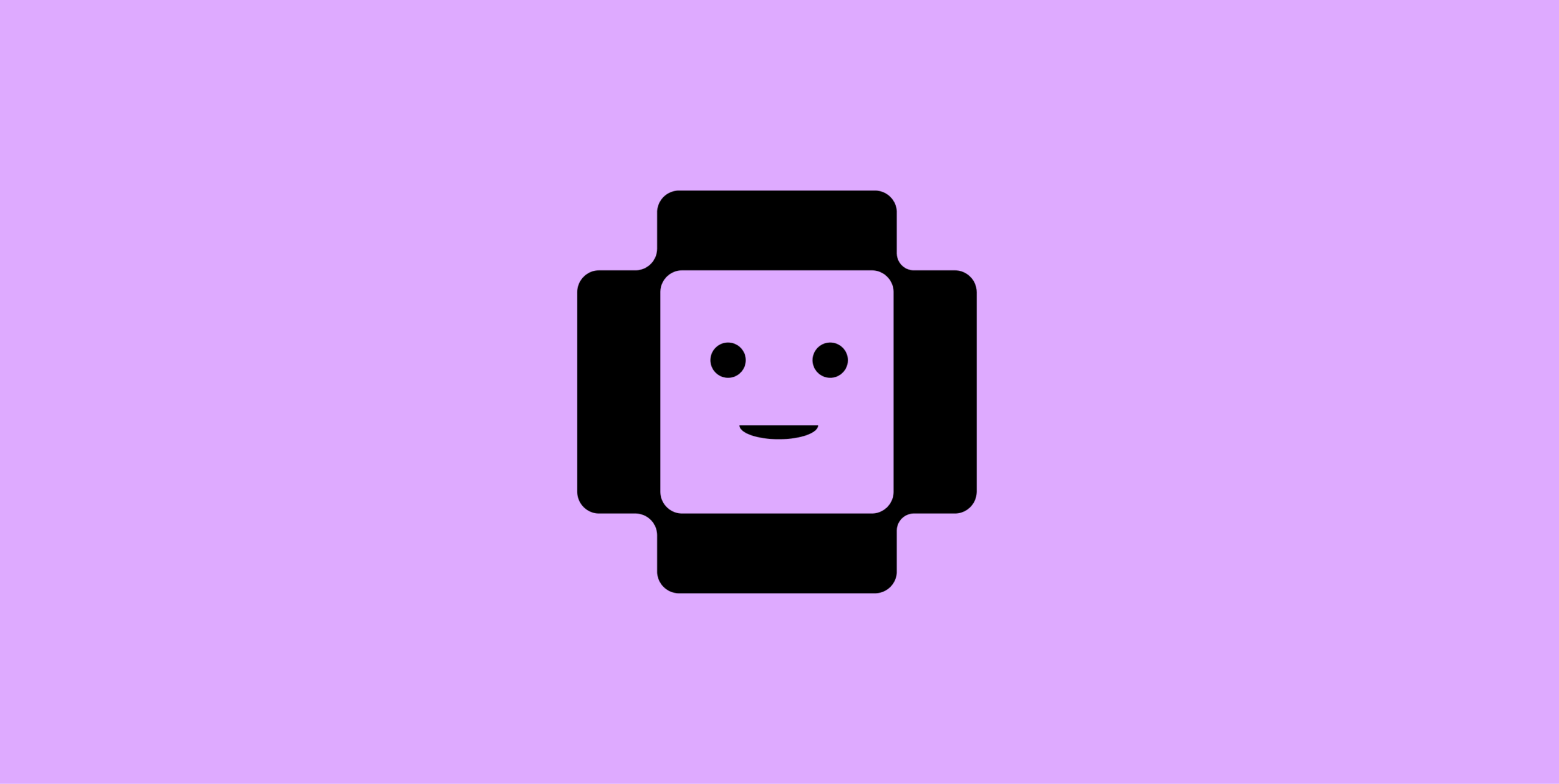
To give isolated remote workers a sense of peer presence, I designed a pixel-style friendly face—the "Companion" character—and integrated it directly into the "O" of the wordmark.
Typographic Rhythm:
I established typography rules using Plus Jakarta Sans and Inter. Instead of dense, corporate formatting, I set the type with a loose vertical rhythm and open line height to ensure the experience remained calm and scannable.
Tone of Voice System:
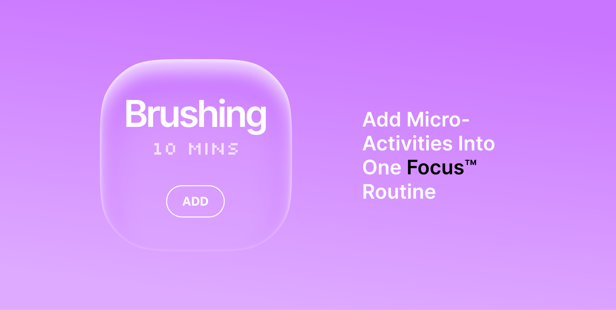
I authored a three-pillar tone of voice system (Casual, Peaceful, Simple) that included the "Guiltless Reset" principle and specific partnership language guidelines.
Accessibility Reflections:
While the monochromatic purple palette creates a soothing aesthetic, I recognized potential contrast limitations. I noted the immediate need to run a strict WCAG contrast audit on all purple-on-purple pairings (using tools like Colour Contrast Analyser) and to lock down a minimum type size system for UI labels and captions.
Strategic Foundation: Successfully defined the core product principle and tone of voice for a saturated tech market.
Actionable Next Steps: Established clear usability guidelines for the next iteration, specifically targeting contrast audits and explicit typographic size rules to ensure an inclusive user experience.
Scalable Deliverables: Delivered a comprehensive brand strategy, scalable design tokens, and component-ready UI assets within a strict 4-week timeline.